Brand Identity & Pre-Launch
A complete brand identity and pre-launch presence for a Trinidad and Tobago slow fashion label targeting petite women, built from a blank brief under early-stage constraints.
Client
White Lantana
Year
2022
Role
Brand Designer. Sole designer on the engagement, working directly with the co-founder.
Stack
Figma · WordPress
Context
White Lantana didn't exist yet. There was a founder with a clear product vision, slow fashion, tropical in sensibility, designed specifically for petite women, and no brand to show for it. No name recognition, no visual language, no web presence. The brief came from the co-founder: establish the brand before the store launched, build an early audience, and prove the concept had a market.
Problem
The engagement had two layers. The visible one was a brand identity: logo, custom typeface, colour system, brand elements, and the guidelines to hold them together. Underneath that was a timing problem. Investment was limited and the window to prove demand before committing further capital was short. The brand needed to go out first, before the product was ready, before the store existed, because without it there was nothing to collect interest around. The landing page wasn't a placeholder. It was the first test of whether the positioning worked.
Approach
The positioning question came early and came from the client: speak specifically to women, name it in the tagline, make it unambiguous. Slow fashion brands often hedge their audience, gender-neutral framing, aspirational vagueness, which can work for established labels but costs a pre-launch brand its clearest advantage. Petite women are an underserved niche with specific frustrations. Speaking directly to them, from the tagline down, was the decision that anchored everything else.
The colour direction, blush pink and deep forest green against near-black, came out of early conversations with the co-founder. The palette needed to hold a specific tension: tropical without being loud, feminine without being delicate, ethical without being austere. Those three things together ruled out the obvious directions. Saturated brights read tourist. Earthy neutrals read generic. The palette that landed felt considered rather than decorated.
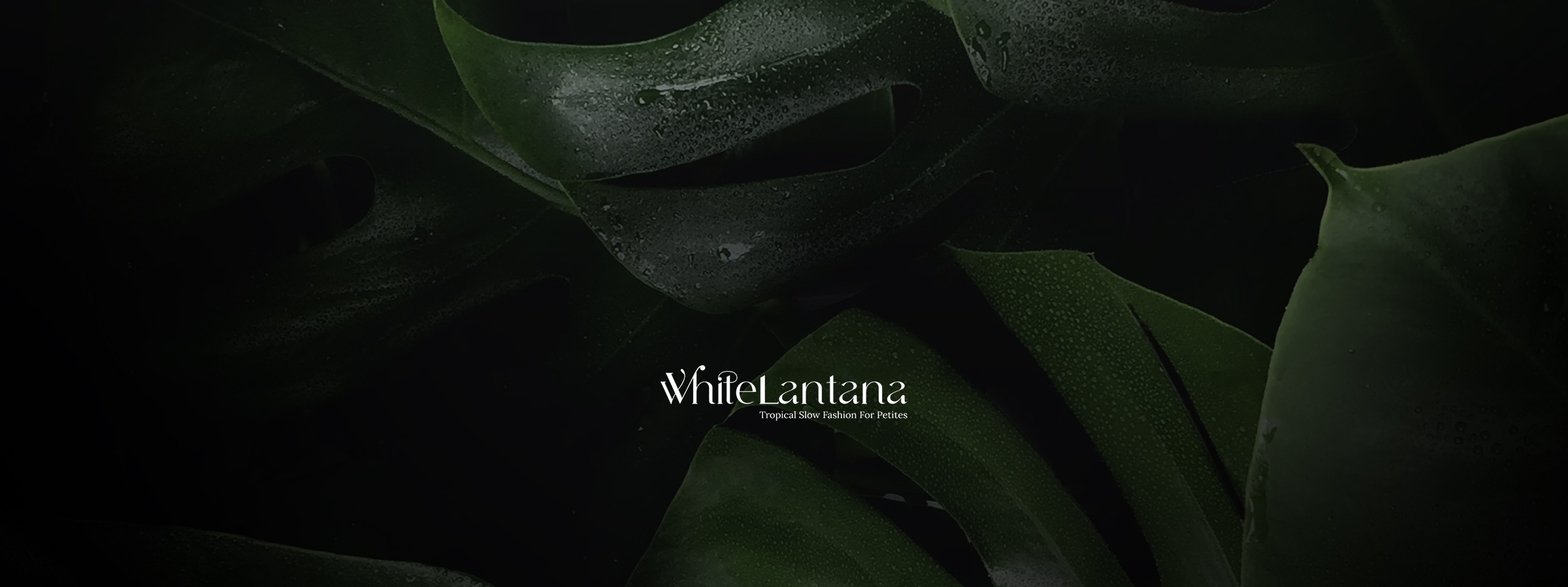
The typeface was the decision that required the most time. The brief needed something that read as both organic and architectural, the slow fashion ethos carried in the letterforms, not just in the messaging. Off-the-shelf options either leaned too hard into fashion editorial cliché or weren't distinctive enough to anchor a new brand. Building a custom wordmark meant the letterforms could be tuned: the calligraphic stroke weight in the capitals, the slightly unconventional terminals, the mixed register that reads as one voice. The construction process gave the letters an internal consistency that a modified existing font couldn't have produced cleanly within the budget and timeline available.
Work
The identity system delivered across three scales. At the wordmark level, the custom letterforms carry the brand on their own, legible at small sizes, distinctive at display. At the monogram level, the interlocked WL mark works as a standalone symbol for applications where the full name doesn't fit: hangtags, embroidery, icons. At the system level, the colour tokens, type scale, and botanical illustration style give the brand enough surface to expand into product, packaging, and digital without requiring new decisions each time.
The landing page was built in WordPress around a single conversion goal: collect email addresses for early access. It introduced who White Lantana was, what they stood for, and asked for nothing more than an email in return. No store, no products, no promises beyond the brand itself.
Outcome
The brand launched ahead of the store, as intended.The brand launched ahead of the store, as intended. The landing page went live and began collecting early-access signups.
What the work produced was a brand system complete enough to carry the business through its launch phase without requiring new design decisions on every surface. The typeface, the colour tokens, the monogram, the illustration style, each piece was built to extend, not to be replaced.
Reflection
Early-stage brand work under budget constraint asks you to decide what the brand actually needs versus what would be nice to have. The custom typeface felt like the right call to spend time on because it was the one thing that couldn't be approximated cheaply after the fact. Everything else in a brand system can be refined over time. The wordmark is the thing that either holds or doesn't from the start.